I have this aspiration to study ‘visual flow’ in more depth, and become a bit of a guru. Visual flow to me, is a concept that I have an almost romantic fascination with. Maybe it’s just a phase, but I’ve recently realised my interest in it.
I would love to use my dissertation as an excuse to explore it further. But I need to find a way of linking it to rhythm and typography. Maybe visual flow IS rhythmic typography?
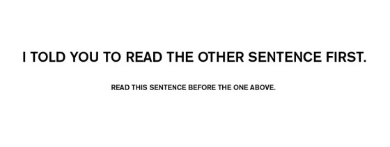
I had a really cool thought, and here it is mocked up:
It is a simple demonstration of how different factors (in this case it is size) can control the visual flow of the reader/audience.

